
Project Goal
In this project, I responded to a brief in which I was tasked in speaking about the topic of Big Data through generative typography. Throughout the project I learned to utilise p5.js in order to create typographic images to visualise real user data.
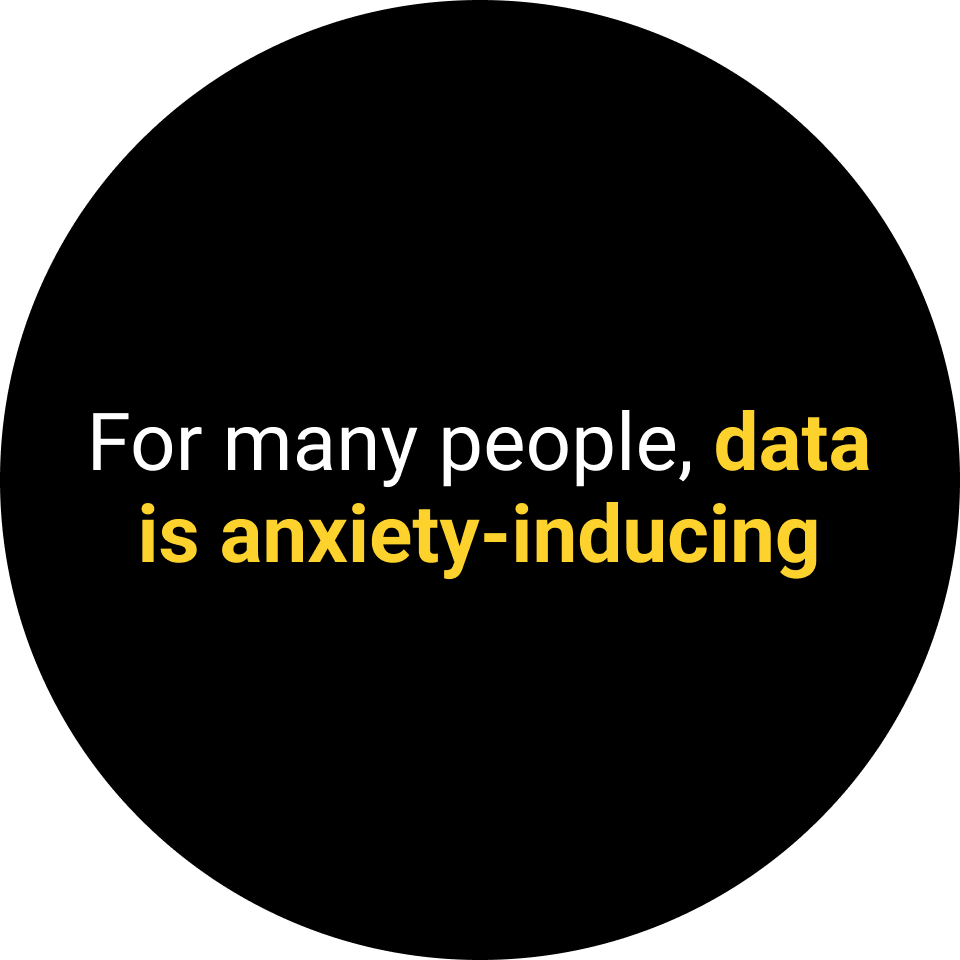
I used this as an opportunity to emphasise the importance of things that connect people. For many people, data is a scary and anxiety-inducing subject. With this in mind, I chose to focus highlight how data can help people to feel more connected to each other.
Secondary Research
I began my research by turning to academic sources which have studied and explored data about human emotion. From this research, I was able to gather key insights to inform the direction of my project.
Key Findings


Primary Research
Driven by my secondary research findings, I delved deeper into exploring the emotions that people feel everyday. I hypothesised that if I were to communicate the various emotions and small moments of peoples day, that I could help people to feel more connected to each other.
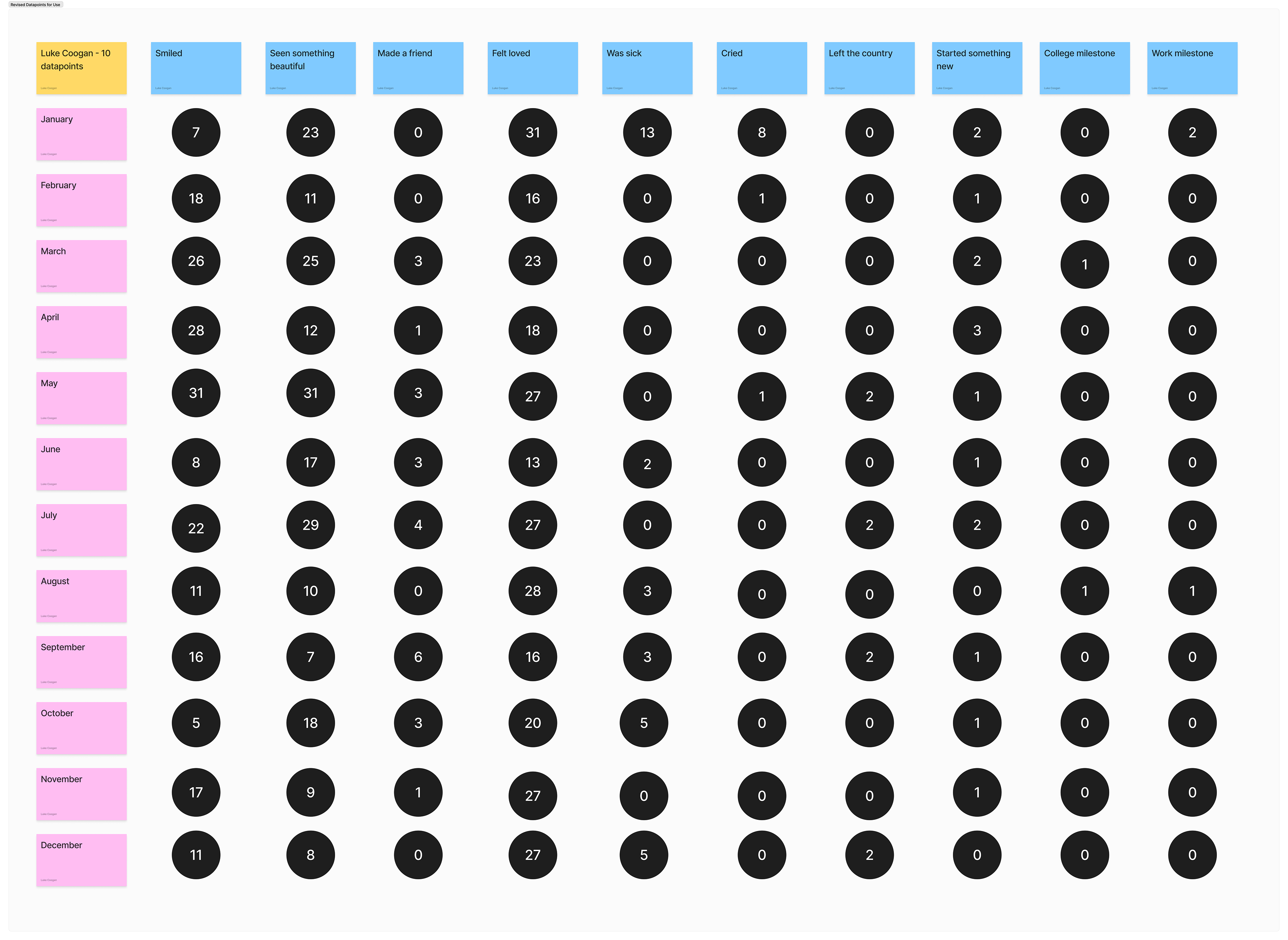
As part of this research, I interviewed and surveyed 2 of my closest friends. The survey was focused on these emotions and smaller moments that they experienced over the course of a year. Users used their phone's camera roll as a reminder for what was going on in their life at that time, the people that they were with and the emotions that they felt.

Bailey Wu, a graphic designer from LA who loves illustration, sunny weather and everything Ireland
Tom Keenan, a software engineer from Dublin. Tom loves cooking, exercise and spending time with loved ones.

That's me! I love design, nature and my friends <3
Visual Research
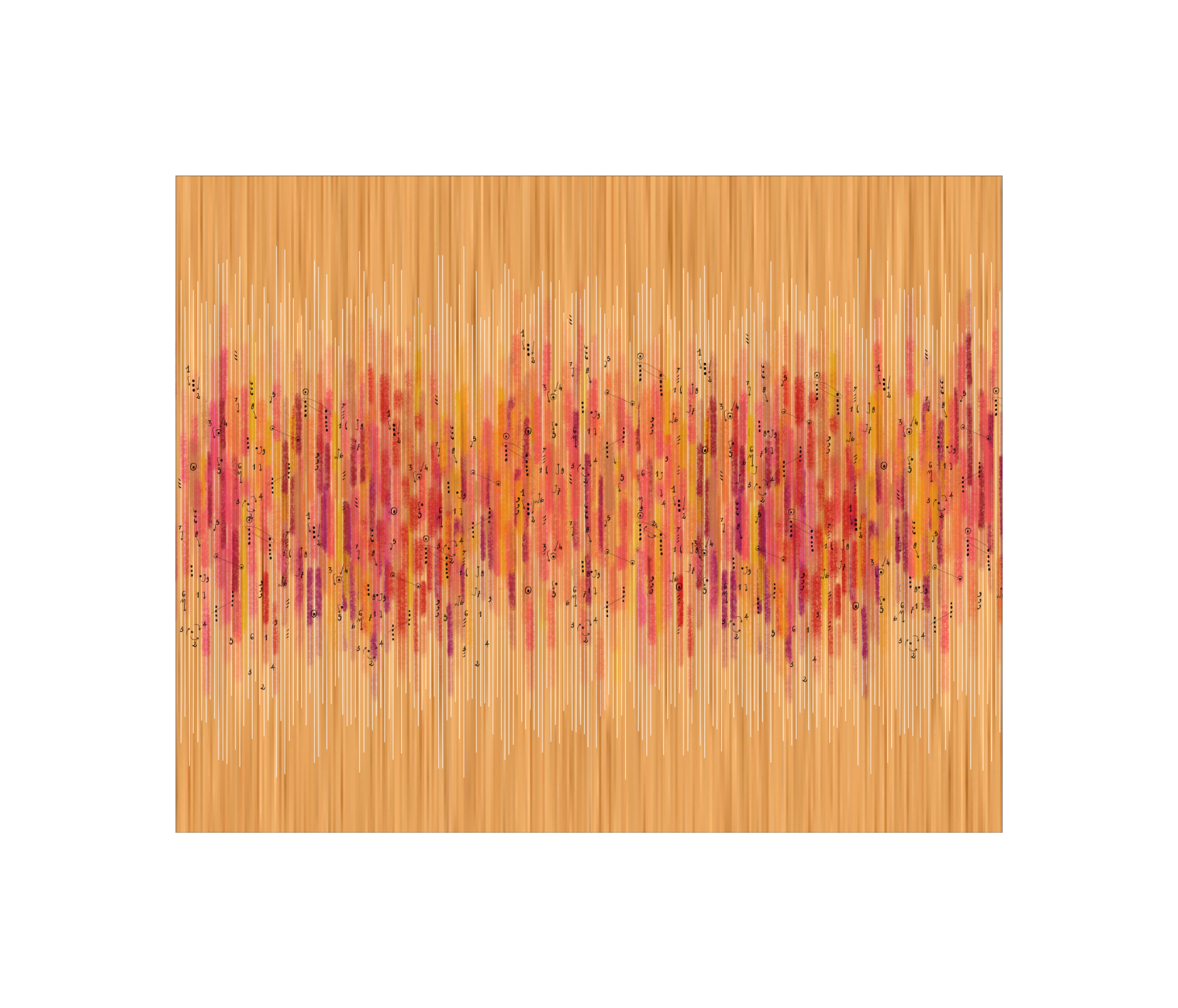
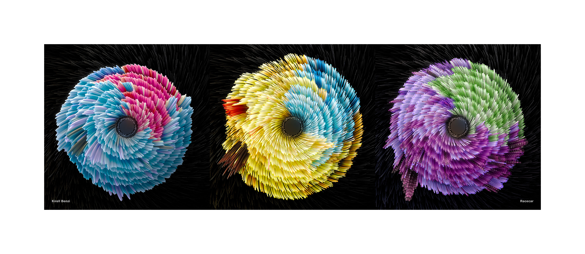
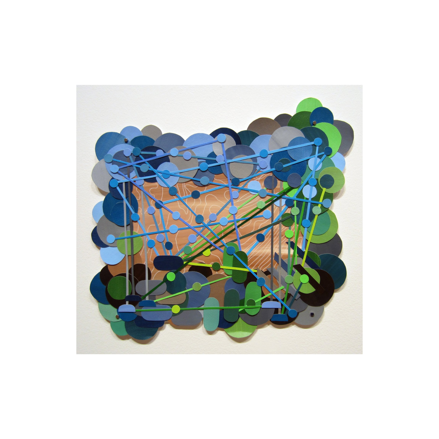
The datasets that I was gathering from my participants were extremely complex, and so I turned to examples of data visualisation which embraced complexity. This search led me to data designer Giorgia Lupi's work, which often focused on highlighting the human elements of data. I also examined how complex datasets are tackled in the art world with examples from Kirell Benzi and Natalie Miebach.
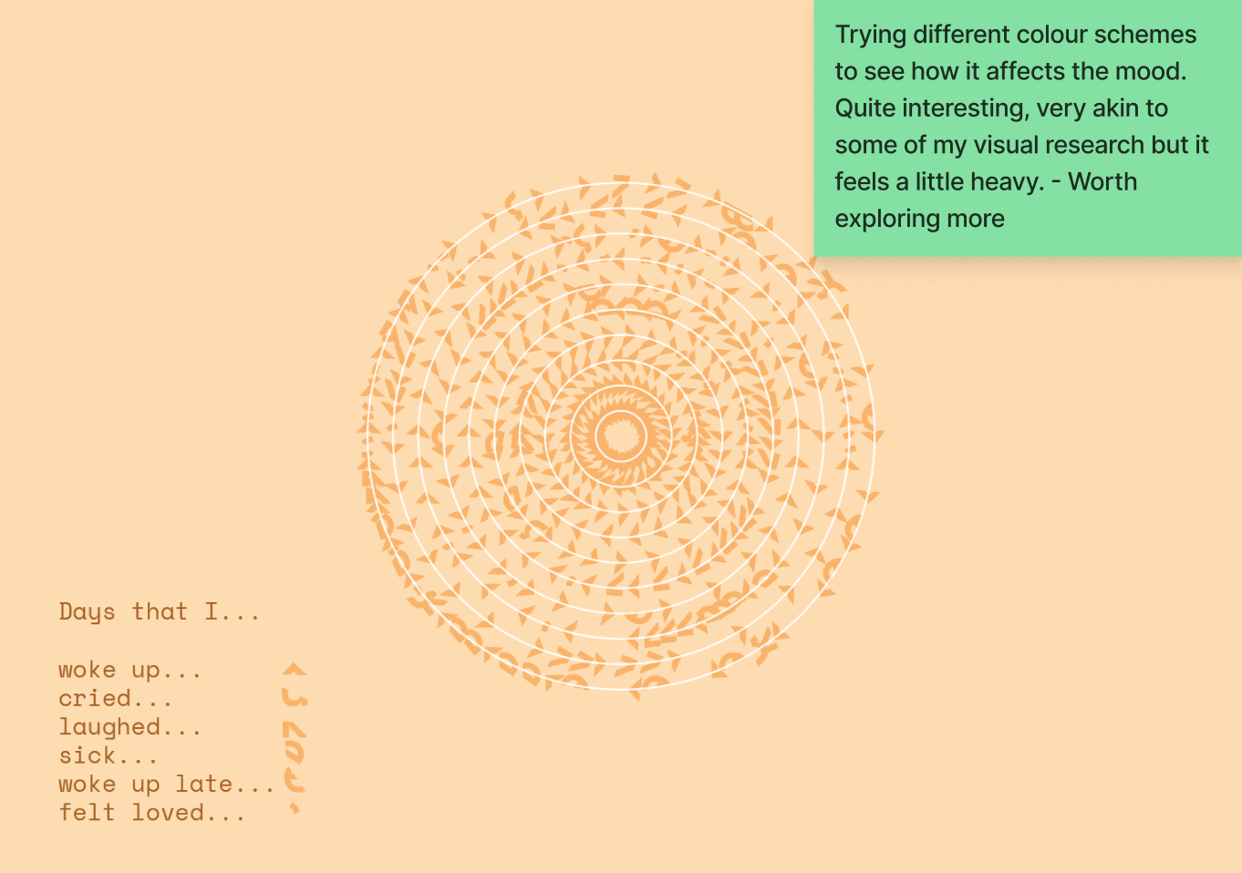
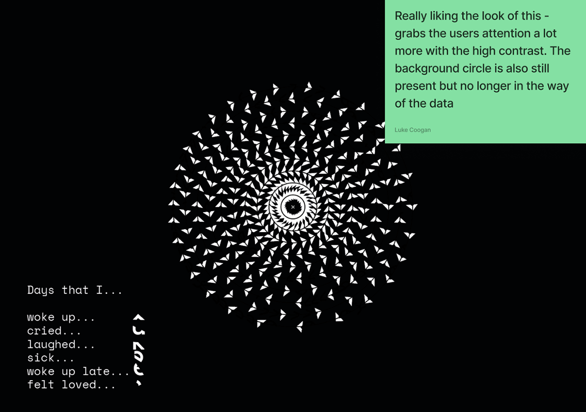
From this research I was able to gain an in-depth understanding of how contrast, colour, scale and repetition can be used to both explicably and implicitly communicate the complexity of data.
From this research I was able to gain an in-depth understanding of how contrast, colour, scale and repetition can be used to both explicably and implicitly communicate the complexity of data.

Iteration
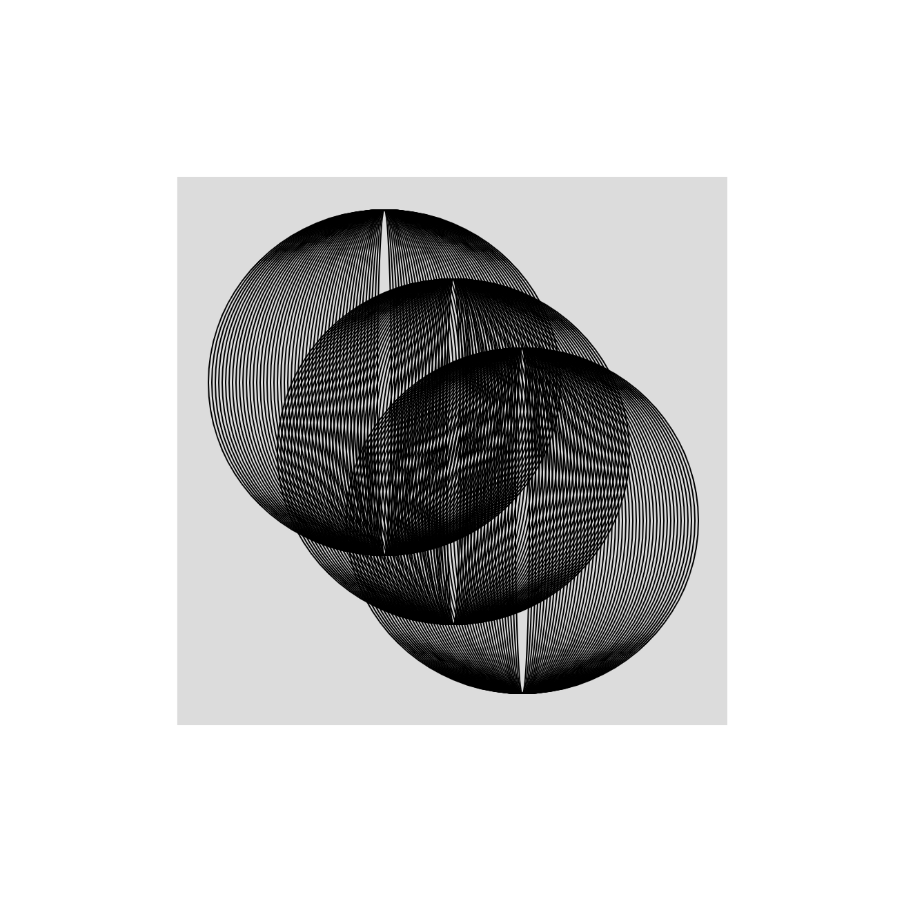
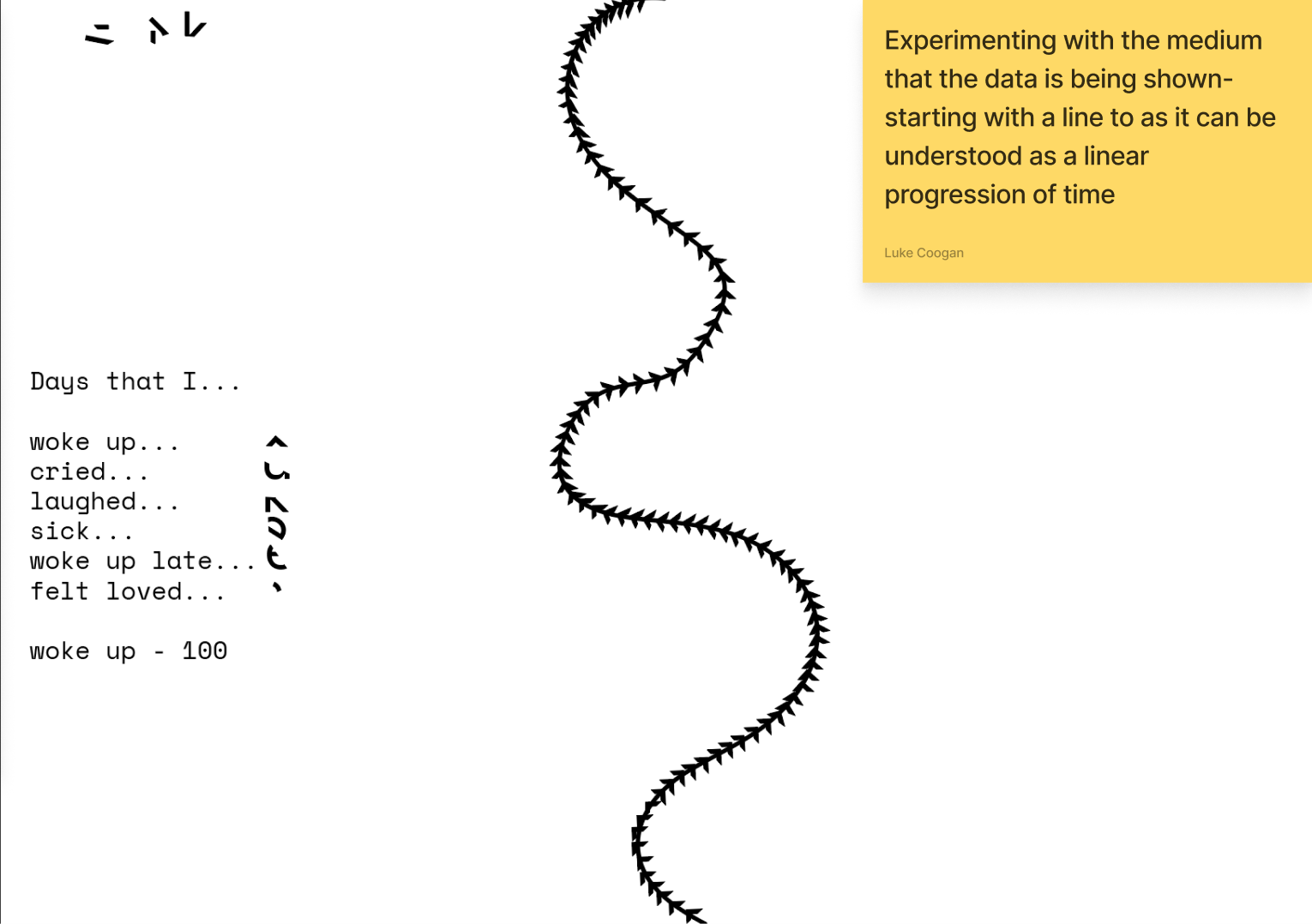
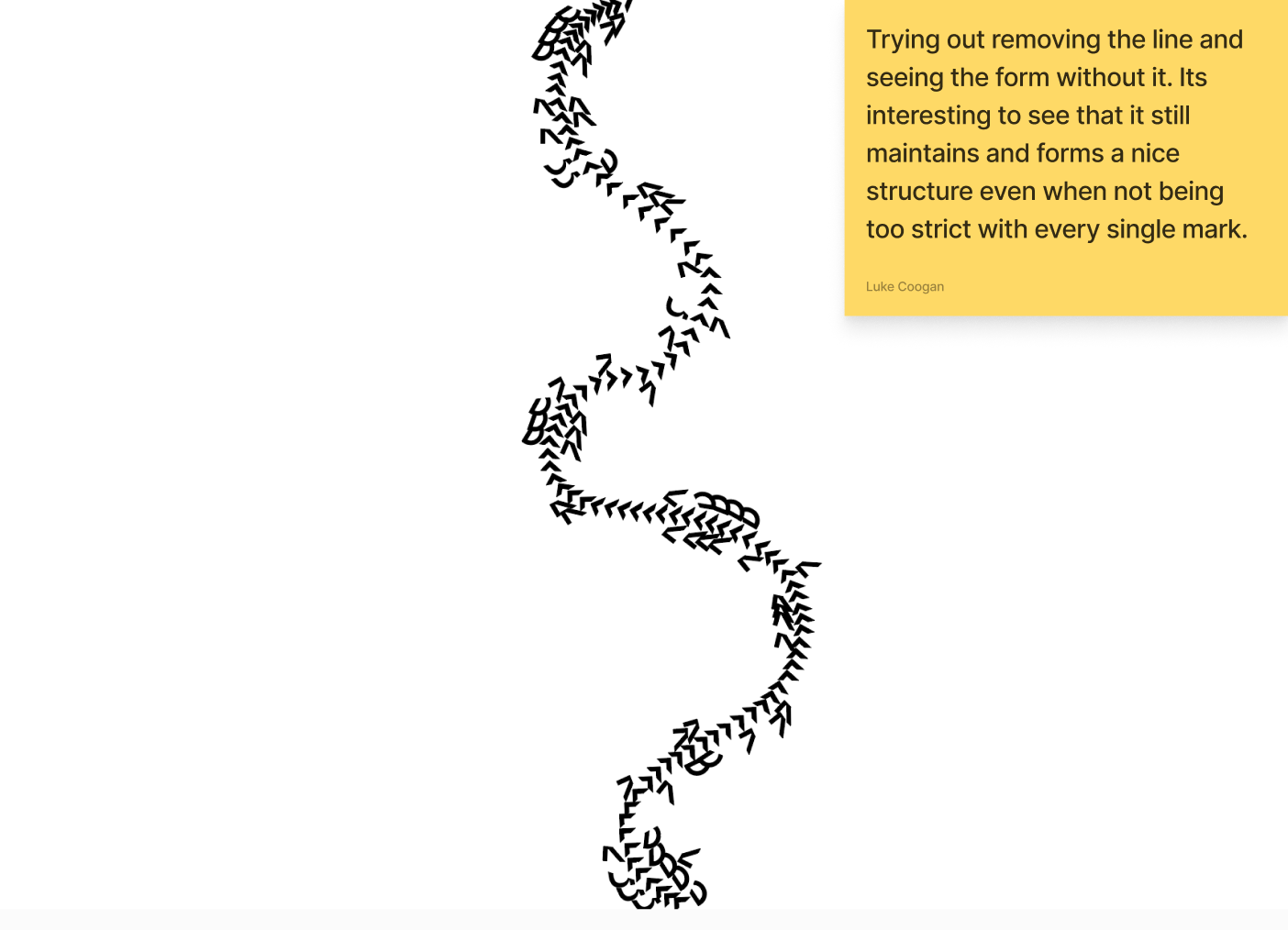
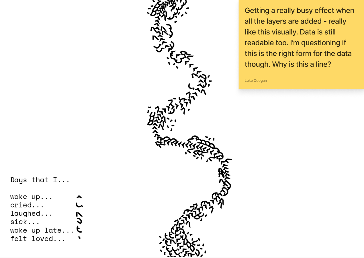
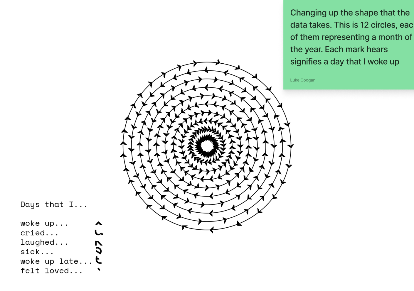
I began to experiment with p5.js. I began by exploring how to create interesting images using repetition. I realised early on in my iteration that this was a powerful tool to create interesting visuals in p5.js.
I continued to iterate on how I would represent the datasets gathered from my participants, before eventually recreating my final outcomes as p5.js experiments, as part of a website.


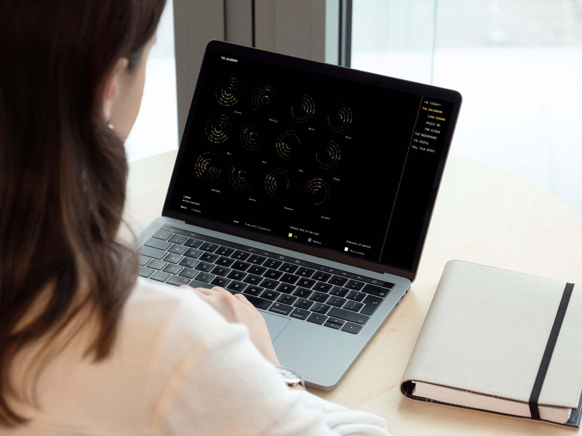
Final Outcome
For my final outcome, I created a series of 36 data visualisations using p5.js. The data visualisations are based on real data gathered from myself and my two closest friends, highlighting the emotions that we feel from day to day, but are rarely recorded.
Each datapoint is categorised based on the intensity of the action taken, emotion felt and the intensity of the emotion. Each emotion is colour coded based on their correlation to plutchik's wheel of emotion. This led to a series of interesting visualisations which told their own stories, even at a glance.
Overall, I considered the project to be a success. As I conducted the research and created the visualisations, myself and the participants learned more about each other about the things that are rarely talked about and the data that was collected made us all feel much closer to each other.
The data visualisations are contained within a website that tells the story of the project. Below is a recorded walkthrough of the website.